

Your website might not be the very first impression your future clients or readers have of you, but when they do visit, what impression does it give them? Despite the potential impact of a great homepage on the people we want to reach, it’s easy to find ourselves thinking “But, I hate marketing.”
“Marketing is a reflection of culture.”
Ann Handley, author of Everybody Writes
When marketing feels daunting, I remember this quote from Ann Handley, author, marketer, writer of superlative newsletters. It’s from a community discussion she presented: The Imperative of Human-Driven Content. “Marketing is a reflection of culture; it’s a reflection of who we are at any given time.” This reminds me that at its core, good marketing is really about effective communication – we can share something about ourselves and our values, and connect with our audience in a meaningful way.
- Not everyone needs a website
- Four areas to answer three visitor questions
- Theme 1: Who are you
- Theme 2: Layout & design
- Theme 3: Insightful information
- Theme 4: Writing effective copy
- One takeaway: be more you
- Homepage example
- Homepage template
- Conclusion
Not everyone needs a website
For editors, it depends on your target audience and what they expect and, more importantly, how people find you. I have colleagues who get all of their work through word-of-mouth without a website and they have no interest in making one. But for those of us who do choose to have a website, it can play a vital role in attracting the kind of clients we’re looking for, and if you’re an author, the kind of readers who are looking for books just like yours. How do you show visitors they’ve come to the right place?
Four areas to answer three visitor questions
My own recent escapades updating my website led me to analyze 28 editor websites, not to snoop on friends but to understand what makes great homepages effective. I had an imaginary editorial project in mind and I wrote down pretty much everything I thought of as I visited various sites. I used traditional search to find individual editors to simplify the selection process. You can do this for your genre or specialism (it’s a type of heuristic analysis and gut reactions are totally valid).
My copious notes revolved around four themes:
- Who you are and what you do
- Layout and design
- Insightful information
- Writing effective copy
The more websites I read, the more I noticed three common questions going through my mind. Is this person legit? Are they relevant to me, as in can they help me? And if yes to those questions, how do I find out more or get in touch with them? If you’re an author, what kind of questions might your visitors have as they visit your site?
Theme 1: Who are you
- Use an informative heading before readers have to scroll ✓
- Mention the types of editing or services you do ✓
- Mention who you help ✓
- Having to scroll all the way down to the bottom to find you only do book coaching (when I had something else in mind) can be disappointing ✗
This first theme sounds the simplest, but seems to be the hardest to put into practice. I found only 21% of the websites I looked at answered this clearly above the fold, before visitors have to scroll down. Let visitors know immediately who you help and what you do for them. This isn’t just about stating your services, it’s about connecting with your visitor and assuring them that they’re in the right place.
Further down the page there’s a practical task borrowed from my marketing friends Frank and Marci which can really help you dig into this first theme.
Theme 2: Layout & design
- Logical top menu for easy navigation ✓
- Use relevant images or other design features to break up text ✓
- Clear and clean layouts, including clear buttons ✓
- Headless stock photos can leave us wondering whether that’s you or not ✗
Fifty-seven percent of the websites I looked at had a clear layout and design that looked attractive, was easy to navigate, and wasn’t distracting. This makes for great user experience.
Relevant images are valuable. This doesn’t necessarily mean that your own photos have to be of your face if that’s not something you’re comfortable with. For example, a bookshelf shot can immediately convey areas of focus and expertise. Professional artwork is a luxury bonus – it stands out if you have it, but it’s certainly not necessary in order to have an effective website.
Theme 3: Insightful information
- Describe your services to build reader confidence ✓
- Consider including ballpark pricing or a price range ✓
- How to get in touch with you / next steps ✓
- Don’t be so reluctant to write about yourself that it sounds like you could have woken up yesterday and started offering editorial services on a whim ✗
Sixty-four percent of the editorial websites I looked at were really clear on providing additional information that builds trust and confidence. If you’re describing your services, it’s a good opportunity to show what you’re telling, like in fiction. If you’re saying “I am detail oriented and care about my projects” you can show that attention to detail and care in the way you describe your services.

I made this image with Adobe Firefly – trained on licensed images.
Alternatively, you might have impressive credentials, and that might be enough to build trust with your type of audience. I think this can be true for academic editors or translators in certain fields. For the space I work in, independent authors usually like to see prices. They might assume you’re too expensive for them otherwise.
Whether or not to include pricing is a personal choice, but it’s essential to present enough information to build trust. If you’re not sure about showing prices, you can hide them a bit. I saw this done very effectively on a few pages. Put it in a menu somewhere or through a couple of pages. Then, people who are really interested in working with you will find your prices, but not just anybody taking a quick glance at your site, unless they’re doing heuristic analysis!
Theme 4: Writing effective copy
- Using “you” instead of “I… I…” can make it relatable ✓
- Mention your background or what qualifies you to edit my work ✓
- Mention something unique and something important to you ✓
- Generic copy is boring, but attention-grabbing copy shouldn’t be at the expense of clarity ✗
This is something we find a bit harder when we’re not so used to writing about ourselves. Only 36% of the sites I looked at had what would be considered best practice copy. One of the most common issues is consecutive paragraphs starting with “I”. Try to turn that into something your reader can relate to by using “you” sometimes. What’s in it for them? What do they get out of working with you or reading your book? Indicating your values is something I want to become better at because it can help us find the right people.
It’s okay to sound a bit generic when you’re starting out; your copy can become more uniquely you over time. Again, it depends on your target audience and to know them well is your biggest strength.
One takeaway: be more you
If I’ve learned one thing over the last couple of years of marketing adventures it’s that it’s okay to repel the wrong kinds of people. They can get out the way and makes room for the right kind of people, those that you do want to work with. You don’t want to market to everybody, just the type of people that are going to benefit the most from your help.
So the first theme, who do you help and what do you do for them, seems to be the trickiest to get clear at the top of homepages. To condense this down, my marketing friends Frank and Marci recommend imagining how a friend or colleague might introduce you. So, “Who’s that over there? Oh, it’s Sara gone to get some coffee. She helps this kind of person with a certain kind of thing. She’s really, really good at whatever it is. You should totally talk to her if you need this kind of help.”
Now imagine they were talking about you. What might others say about you? One way Frank and Marci recommend finding the words for this is to dig through your testimonials. Find those nuggets and adapt them to use in the headlines and text at the top of your pages.
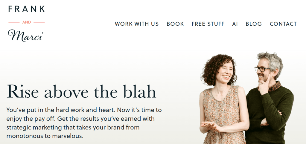
Homepage example
Frank and Marci’s homepage, frankandmarci.com, is a great example that follows the four themes I identified, even though they’re not offering editorial services! They’ve got a logical top menu, you get a clear idea of who they are and what they do, the images are actually them, and I feel like the copy is talking to me. And the rest of their site is awesome too. What do you want to get across straight away at the top of your homepage?
Homepage template
This blog post from Andy Crestodina has a great infographic (it’s much more comprehensive than the snippet below) that’s a helpful starting point for thinking what to put where on your homepage. You don’t have to include the things you don’t want, but I bet this template will give you ideas of how to make an impact when people visit your site. The full infographic and detailed explanations are available in Homepage Best Practices.

Andy Crestodina, Orbit Media – go see the full infographic in all its glory.
Conclusion
Being an introvert can actually be your marketing superpower. Detailed research and empathy for your clients can help you develop an effective homepage that prioritizes clear messaging, user experience, trust-building information, and copy that connects with your readers. The themes I’ve focused on here will be too narrow for some, but you can always carry out your own heuristic analysis to see what works well in your space, and what would be “even better if…”
Good luck and I’d love to hear what you come up with!
You might also like:

Leave a comment